Logo Design & Branding

I design bold logos and create brands that embody your core identity and personify the spirit of your organization.
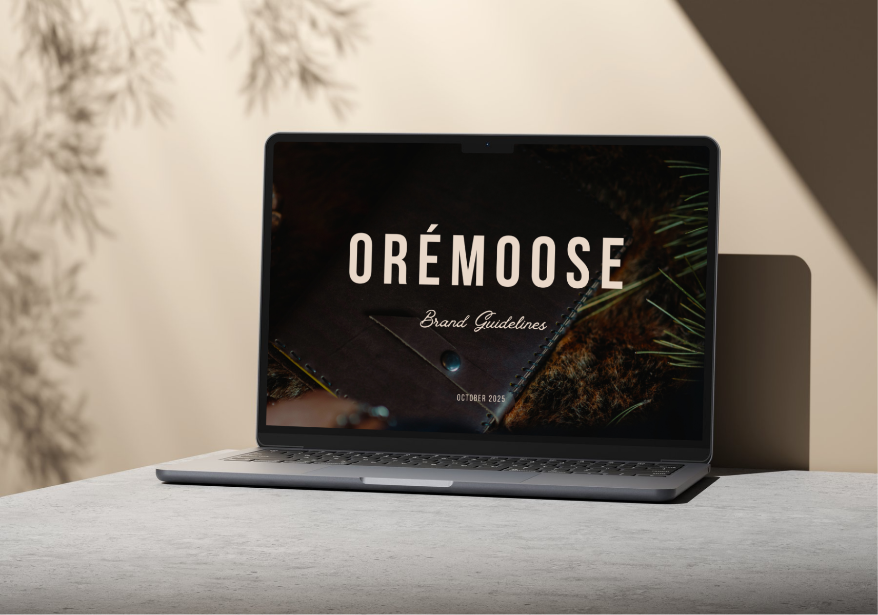
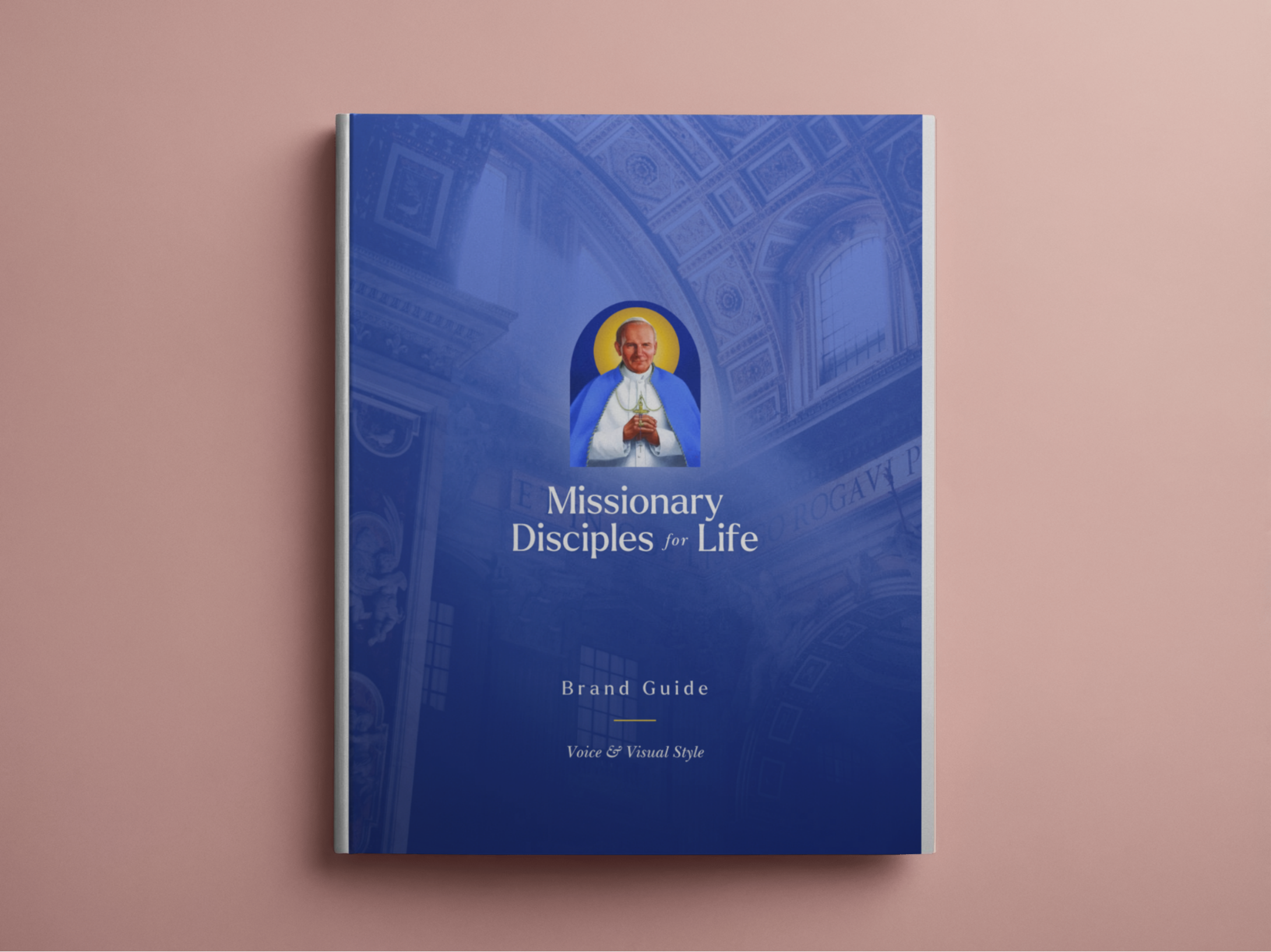
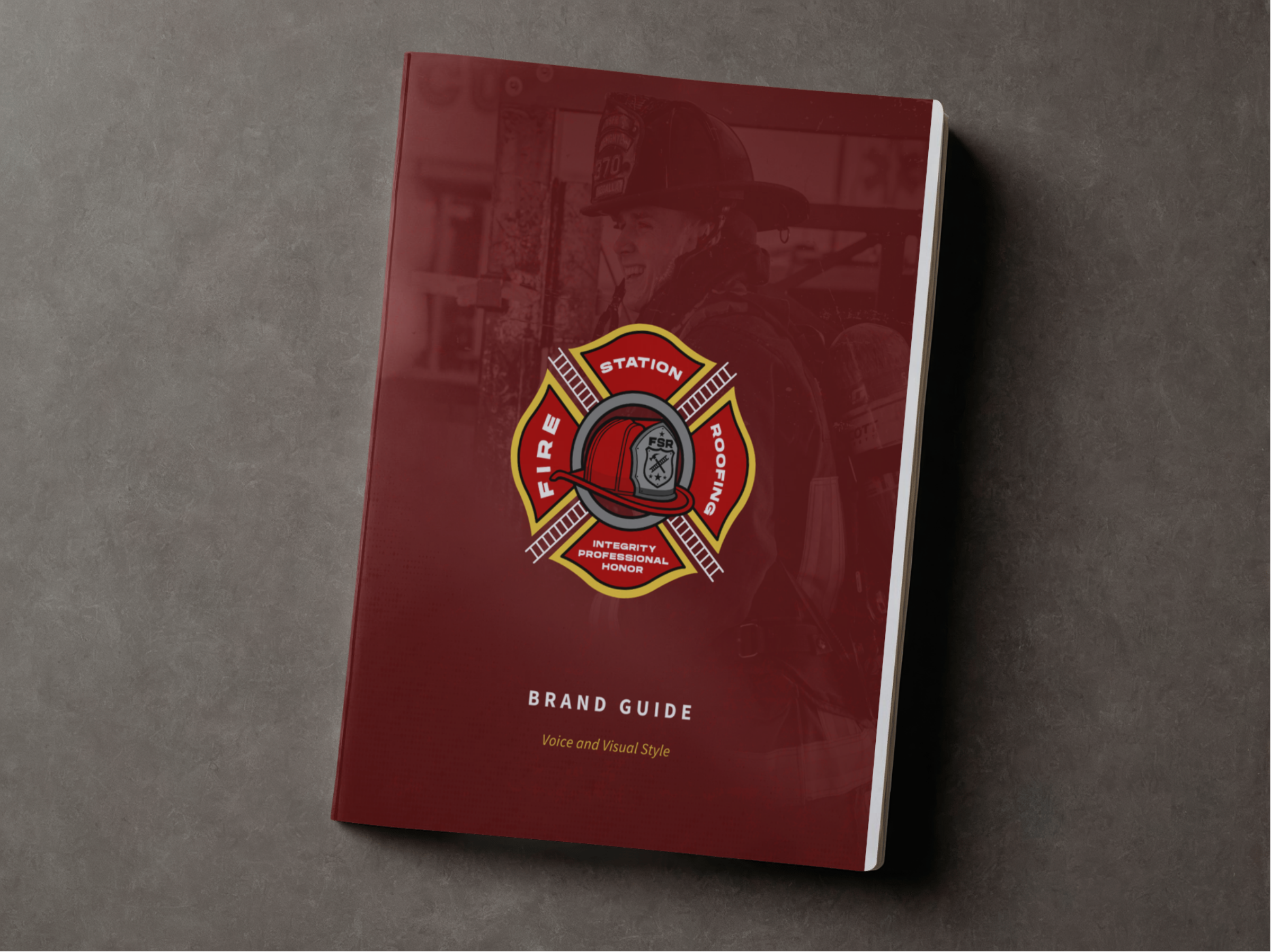
 

Select Logo Portfolio

 
Artboard 12.png

The Office of Youth Ministry, Archdiocese of Kansas City, KS

This client expressed to me how they wished their graphics could cry out, “We are alive and well, and we are beautiful!” Combining the quasi-neon turquoise-blues and purple-pinks with the earthy undertones of orange and brown in a liquid medium allowed me to embody the youth of today while offering a hopeful snapshot into the vibrant future.

text984.jpg

The Valor and Virtue Conference

This client asked for a total design overhaul and for a logo that said, “Simply strong.” Considering how part of their mission is to build up a strong, virtuous, and honorable community, I utilized a brick-like shape and a bold, san-serif, monospaced font.

KC.jpeg

Prayer and Action of Kansas City (PandA)

This client shared how they wanted something simple yet playful. Taking into consideration their unique nickname, ‘PandA’, I designed this cute bear and paired it with a rounded, sans-serif font that has a similar width to the bear’s outline. Simple and playful.

ShamrockCOLOR.png

Shamrock Roofing and Construction

This client was wanting to put a small twist on their preexisting logo, freshening up the color selections with a few other more vibrant options and extending the roof beyond the lettering to embody the nature of their work more explicitly.

AY+Logo23D+copy.jpg

Church of the Ascension Youth Ministry (Overland Park, KS)

This client wanted something that sang of nature and adventure, that called people beyond themselves. Going with a speckled, metal campfire mug aesthetic, I utilized a dark teal that easily doubles as a night sky and flowing river. Notice also the use of circles within circles, and within the smallest one (the moon) is the Cross, which embodies the entire purpose of their mission.

g1067.jpg

The Kansas City, Kansas Parish Twinning Initiative

What better opportunity to use our hometown’s acronym than on an organizational that is focused on ‘twinning’? It was a win-win, all around.